Tuesday, April 5, 2016

Logo Post

My favorite logo is the Batman logo. It is simple and memorable, it does not need to be explained in the sense that some do. More than just showing the logo, many people would remember what it is and recognize it.

I liked this logo because it embodied what the agency is and what it does.


The camera in the "C" makes it clear that the agency is about and what it stands for.
 Though this is a conservative (right-wing) party, there is many parts of the logo that makes it catchy sort of like the GOP elephant and the Democrat Mule or Ass. 
The logo is pretty self-explanatory into what the company is about and what it does.


The logo is about the NY Islanders and it shows how much of the team is based on the fact that it is based in Long Island and how it has shifted its history 

Tuesday, March 22, 2016

Poster Project reflection


  1. In my Poster I believe that I illustrated my point clear that Donald Trump is pushing for a Fascist agenda that deeply is favorable for White Power and its allies. The reason why I chose the red and black is because they have been used in many fascist governments, and the lettering is in opposite colors for example Red on Black and Black on Red due to making the letters stick out.
  2. From my thumbnail sketches that I had made changed drastically from the final product of this project. Aesthetically, the final product is better than the first couple of drafts.
  3. There were major changes between the first and final draft since in the first it was a hodgepodge of items pasted on to each other. 
  4. Conceptually, the hardest part of the project was how to make a political statement in the illustrator file as well as making it fit the idea
  5. Technically, the center region was the hardest to make due to the merging of the center region's oval and Donald Trump's image.
(Final)

Tuesday, January 12, 2016

Issues I care about


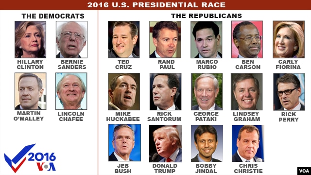
My first topic is the current Presidential Election Cycle, especially in worrying of the Republican Party. Though in the Democratic Party it is pretty much settled between two people, but on the Right there are over ten hopefuls. But the most worrisome part is the fact that there is more hatred brewed by the frontrunner, Donald Trump. I've strongly disagreed with his policies because of how ludicrous they could face to the nation as it is implemented in real life. The main reason why I am against his policies is because of the ways that it could be disastrous for the nation, especially his tax code because of the way that the poverty line would be higher each year.


The other is college costs, because of how high it is to pay for college. I have a special circumstance since I am part of a two home upbringing and one parent, I don't know if he would pay. In other countries, higher education is pretty cheap or free. For instance, the EU and my home country combined for four years, all costs should come around $10,000 or $20,000. In the EU, it is free for most countries and also it is widely appreciated by their citizens.
Cost of college


In a less serious note, the NFL Playoffs are in full bloom. This weekend there was a first time as all four wildcard teams (teams as the #5, and #6 seeds in each conference) won. Last Saturday, after a miraculous or in the case of the Cincinnati Bengals disaster, Big Ben and the Steeler offense had a drive consisting of 9 plays covering 74 yards in a minute and nine seconds for a game-winning 35-yard field goal with 14 seconds left. This drive also sealed that the Bengals have not won a playoff game for the 25th straight year and 8th straight loss within that span.

Wednesday, December 23, 2015

Self Symbol GIF project reflection

GIF REFLECTION

1. My self symbol is swimming due to the many hours I spend each week on working on my strokes and also of the many times I spend thinking about it.  
3. My animated GIF evolved from the thumbnail sketches because in the beginning of the project the idea was for a backstroke flip turn and that proved to be more difficult to draw in photoshop. Also I evolved my idea because of the use of 3 different figures rather than one due to the sheer amount of work needed to move frame-by-frame and also because of the lack of layers it had.
2.

Monday, November 23, 2015

Portrait Project Reflection`

1.The concept behind the the portrait transformation was to highlight the area around Heinz Field (nicknamed the Big Ketchup Bottle by ESPN), in the North Shore of Pittsburgh
2. Apocalypse at the Big Ketchup Bottle
3. I am somewhat happy because I have been restarting the project almost daily, due to many people restarting the computer as well as the lack of thought that I did not email the project daily.
4. 

 5. In the beginning, I cut the sky from the picture in the bottom and the parts that are unnecessary, after that I pasted the remaining part of the Stadium photo, into a new document. After the bleacher was pasted I added the glass filter to make it look like it is, then I pasted a photo of a mushroom cloud and put in the document, decreasing its opacity and erased the border which overlapped with the photo of the stadium and the black border. Finally I pasted the photo of my self, cleaned up some parts with a layer mask, and at the end used the clone tool to make it seem that my face is repeated in my sweatshirt.

Thursday, October 15, 2015

The Letter Z

1. In the beginning of the project we were asked to draw 20 thumbnails. Although my thumbnails are crumbled, there are some that are there that are random drawings.
Here's a picture of them most of which are from natural origin.
Some of the designs are not there but the main focus was in animals or related to animals. The second on the top left was inspired by the hero El Zorro, where after every raid that he did he left his unique and signature Z. 
2-5. For the next phase of the project the two that passed was a Crain and a rabbit. I tried to show how the letter z could be in script or in a form of a rabbit. I thought that the hardest part of the project was the designing because of the way that the letter Z is . I am satisfied with the final product but I could of made the rabbit into a more into an actual rabbit.